Tourtle


Advanced Graphic Design
WHAT HE MADE IN
Over the last month or two I wasn't counting, Ian has made several projects for his Advanced Graphic Design class, which will now be displayed to you in a linear fashion. Please do not scroll without looking at the screen, as that would prevent me from showing them to you in a linear fashion.

01
The Type Poster
Words Words Words! While that was originally placeholder text, I think the phrase 'Words' fits this project well. The challenge was to make someone's face out of just text, so I chose to make a tribute to Steve Harwell, the lead singer for Smash Mouth.
His main body is made of lyrics from 'Walking on the Sun', my favorite song of his. The smaller text that makes up shading is from 'All Star', the Shrek one.
Overall, I didn't want to paint an unrealistic picture of the man, as his brand was always a bit ugly, a bit unflattering, and always down to Earth. I rendered his messy hair, I rendered several chins, all exactly from the original iconic image of him. Even here, as always, he's real. No unnatural prettiness, just being himself.


02
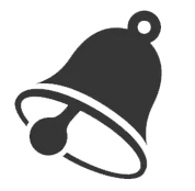
The Bells
This project involved making a book cover for one of Edgar Allen Poe's works, of which I chose The Bells. Don't worry about why it's bold, that just happens whenever you mention the bells.
Also, we had to make too versions, one driven mostly by text, and the other mostly by images. The text driven one is inspired by the four types of metal used in the poem, silver, gold, bronze and iron. Iron, or black, represents death, so that's cool!
The image driven cover is covered in bells. Oh god, that counts to?? Okay whatever, it took a lot of experimenting to get those bells on the cover right, and they look awesome imo. There's even a bunch of bells on the back. Actually, there's a bunch of funny text on both back covers. You probably can't read it from here, so, uh, L.


03
Saturday Saturday Saturday
If you've noticed, each project so far has required more items than the last one. Here, serendipitously, I had to make three entire projects' worth of content for one. And I enjoyed every moment of it.
Twenty One Pilots is my favorite band, despite my relatively recent discovery of them. I've gone to a concert of theirs, and I now own my favorite album of theirs, Scaled & Icy, on CD. I listened to it on my way to school today, it was awesome.
Saturday is a song from Scaled & Icy, and it's about the endless 'vacation' that was the Quarantine. The song is poppy, energetic, and overall fun sounding, while quietly leaning into the idea of how horrifying it would be if that lasted forever, and how you're alone there. I tried to capture that in the mock Album, Vinyl, and Poster for the song. They each have bright colors, high contrast, and a tenuous feeling of despair. They also heavily use Pink, Blue, and Yellow, three colors from the actual Scaled & Icy album.
Or, to use it's full name, Scaled Back and Isolated.
04
Total Bliss
This one's about tea. GREEN TEA. Even if it doesn't make any sense that it's in a bag... I think. It's not like I know anything about tea, either.
Anyway, this one's inspired by pride flags. The MLM flag, for gay people, like me, and the Lesbian flag for the orange on the other flavor. And, since I accidentally color picked the wrong half of the Lesbian flag, there's a bonus peach flavor too.
There's also a whole list of other flavors with other pride flags in mind on the side of each box. A lot of thought was put into how this box would be used, like how the part of the box that gets pushed in has a 'push me' sign, and putting additional flavors on that side would subtly make the consumer think of getting more, especially when they reach in and find that they're running out. Of... tea pods. I'm gonna be honest I really don't know how tea works but I really don't feel like that's right.
Oh also I thought about calling it 'Tourtle Bliss'.


05
The Website
Uh oh! Things are getting meta!
Excusing the fact that you've already seen all these images before, while this project was a lot quicker than the others, I had a lot of fun revisiting all these old projects! Making their colors align with the top ui, finding bits of them to extract for smaller images, and most of all, talking about them.
I'm most surprised by how much I had to say about each one, and how much more I could say were I not limited by space. You might've noticed I haven't talked about website design at all yet, and that's because most of this project is just the writing. And gosh do I like writing.
So, I should probably answer what this site used to be, what changes I've made to it, maybe about the color choices, or-
Oops look at that we're all out of space! Okay byyee!!!